We need to have a serious talk about the “GIF” pronunciation debate. It’s been decades, and yet, here we are, still arguing whether it’s a soft “J” like the peanut butter or a hard “G” like “gift.” Steve Wilhite, the guy who invented the Graphics Interchange Format, has explicitly stated it’s “JIF.” Does that stop anyone? Of course not. We have collectively decided that “death of the author” applies to file extensions, and honestly? Good for us. If you say “graphics” with a hard G, you’re going to say GIF with a hard G. Logic is a beautiful thing.
But while we’re busy arguing over linguistics, we’re ignoring the digital chaos happening on our hard drives. You’re saving screenshots as .jpg, uploading logos with weird white halos, and wondering why your beautiful vector art looks like it was printed on a dot-matrix printer. The world of image file formats is a mess of competing standards, abandoned legacies, and “good enough” compromises that we’ve just learned to live with.
Here is the uncomfortable truth: there is no perfect format. There is only the right tool for a very specific, annoying job. And if you pick the wrong one, you’re not just wasting space; you’re actively making the internet a uglier place.
Why is your logo surrounded by a white fuzz?
You’ve seen it. You slap a perfectly good logo on a website background, and suddenly it looks like it was cut out with safety scissors by a toddler. That jagged, inconsistent outline? That’s what happens when you don’t understand transparency.
Here is the hierarchy of “see-through” images. At the bottom, you have the dinosaurs: JPG and BMP. These formats do not do transparency. If you save a logo as a JPG, you are sealing it in a rectangular box of solid color. Good luck with that. Then there is GIF, the quirky relic of the 90s. GIF allows transparency, but in the most restrictive way possible: you get exactly one color that can be fully transparent. That’s it. No gradients, no soft edges. You usually pick neon green, pretend it doesn’t exist, and hope the background matches. It’s a bit weird to call it a “color” when the whole point is that it’s invisible, but GIF has never been known for its logic.
PNG, on the other hand, is the savior we needed. It supports a full alpha channel, which is fancy talk for “every single pixel can have its own level of opacity.” This lets you fade edges smoothly into the background. If you have ever seen a crisp icon that looks like it was painted directly onto the screen, it’s probably a PNG working its magic. It’s lossless, it supports transparency, and it makes your edges look professional. Why wouldn’t you use it for everything?
Are you accidentally deleting your data?
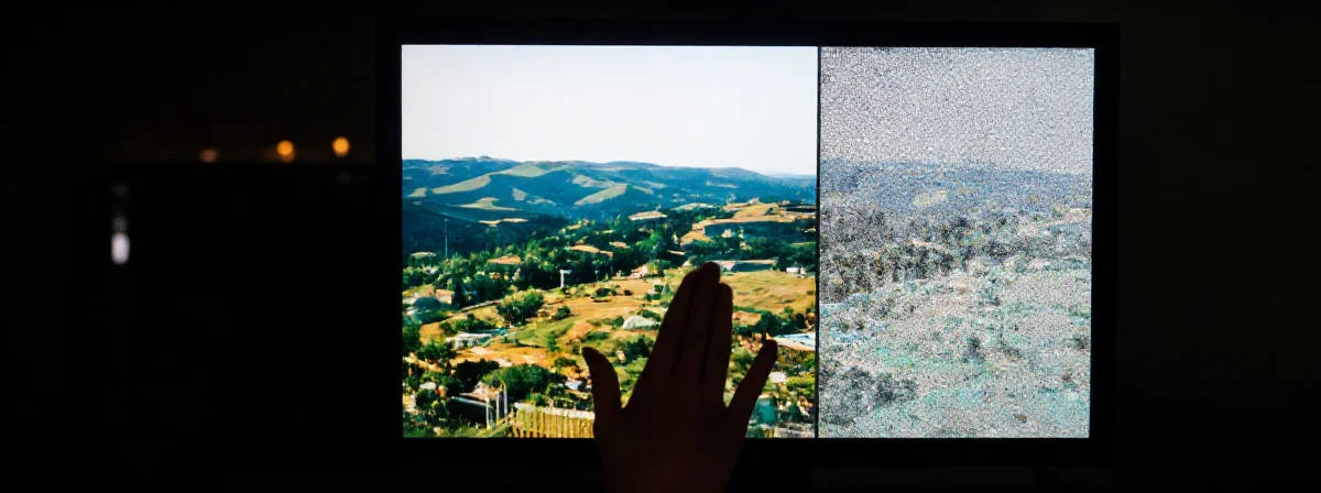
Here is a fun experiment. Open a JPG, save it, close it, then open it and save it again. Do this about ten times. Now, look at the image. It looks terrible, doesn’t it? It’s probably full of weird artifacts and blocky noise. Congratulations, you’ve just witnessed “lossy” compression in action.
JPG is designed to be efficient, not faithful. It throws away information it thinks your eyes won’t miss to make the file size smaller. It’s great for vacation photos where you don’t need to count the pores on someone’s nose, but it’s disastrous for anything requiring precision. Every time you re-save a JPG, you are compressing already compressed garbage. It’s like making a photocopy of a photocopy of a photocopy—eventually, you’re just holding a grey piece of paper.
PNG, by contrast, is lossless. It keeps all the data. Every pixel. Every nuance. It’s the middle ground between the bloated BMP (which stores data for every single pixel with zero compression, resulting in files the size of small asteroids) and the destructive JPG. You get the quality without the hard drive bloat. It’s the best friend of screenshots and pixel art. Seriously, do not save pixel art as a JPG. Eugh.
Is WebP actually the future or just more Google nonsense?
Just when we had figured out the trio of JPG, PNG, and GIF, the tech giants decided we needed a new problem. Enter WebP. It’s Google’s attempt to create a “unified” image format—one file type to rule them all. It can do lossy like JPG, lossless like PNG, and it even supports transparency and animation. On paper, it sounds like the holy grail.
In practice, it’s a bit more complicated. WebP is incredibly efficient, offering smaller files with less quality loss. It evolved out of the VP8 video codec and is basically a love letter to server admins who want to save money on bandwidth. But there is a catch: it takes longer to create. WebP sacrifices compression time to optimize file size and decompression speed. It’s built for the web, where an image is created once but viewed a million times.
But the industry never stops. Just as we were getting used to WebP, along comes AVIF and JPEG XL to ruin the party. There is always a new standard promising to be faster, sharper, and lighter. It feels like an evil cabal designed specifically to make our lives harder. But hey, at least your internet connection will be slightly faster, right?
What is the deal with TIFF?
If you thought GIF was weird, wait until you meet TIFF. This format is essentially a hoarder. It was originally designed for early scanners and faxes, so it has compression algorithms for documents that haven’t existed since the 90s. But it grew into something strange and powerful.
TIFF is insane because it can store multiple images in a single document, sort of like a GIF that usually isn’t animated. It supports layers. It lets you customize how many data values are in a cell. This makes it the gold standard for scientific work and satellite imagery, where you might need to store elevation data or population density as pixel values rather than colors. It’s also essential for high-end print work and archival. If you need a high-resolution image that might need to be processed later, TIFF is the tank you drive into battle.
For the rest of us? It’s overkill. It’s like bringing a flamethrower to a toast-burning contest.
Why do we have so many languages for images?
It’s worth noting that SVG is the outlier here. While everything else is raster (pixels, dots, grids), SVG is vector. It stores mathematical instructions—lines, curves, shapes—rather than pixel data. This is why SVG is perfect for logos and icons. You can scale an SVG to the size of a billboard and it will remain perfectly sharp because the computer is just redrawing the math. It doesn’t store “what it looks like”; it stores “how to draw it.”
Ultimately, the proliferation of file formats is a lot like human languages. We never really needed both French and German, but here we are, unable to agree on a single way to communicate. German is like BMP: incredibly precise, able to construct unique, situationally fitting words on the go, but often clunky and huge. French is like a compressed JPG: shorter, relying on specific endings, efficient, but sometimes losing the nuance in the noise.
We keep inventing new formats because we refuse to compromise on different priorities. Some want speed. Some want quality. Some just want to save a funny cat animation with a transparent background. It’s a mess. But at least it’s a mess that works, most of the time.