Ever since I first booted up my Lenovo IdeaPad 3i Chromebook, I felt like I was fighting the machine instead of working with it. The UI felt alien, the keyboard layout baffling, and even simple tasks like opening Google Docs became a chore. Back in the 90s, we didn’t have these sleek devices—just clunky terminals and DOS prompts—but at least everything was straightforward. Now, even a simple Chromebook seems to hide its own logic. What gives?
The truth is, Chromebooks are designed for a different kind of workflow—one optimized for quick tasks and cloud-based apps. But if you’re a writer, like me, you need something more intuitive. Here’s what’s really going on beneath the surface, and why these “quirks” exist.
Why Does the Chromebook Keyboard Feel So Wrong?
I remember when I first saw that launcher button replacing the Caps Lock key. My first thought: “This is madness!” But after years of tinkering with tech, I’ve learned that design choices aren’t random. The launcher button is there because Chromebooks are built around the idea of launching apps quickly—just like the Windows key on a PC.
But here’s the kicker: the Control key is oversized for a reason. Back in the 90s, we used Ctrl for everything—from copying text to navigating menus. Chromebooks double down on this, assuming you’ll be using keyboard shortcuts constantly. The problem? If you’re a writer who relies on Caps Lock for… well, capital letters, you’re SOL. The solution? Remap the launcher key to Caps Lock in the settings. It’s buried deep, but it’s there.
Google Docs on Chromebook: Why Does It Feel So Clunky?
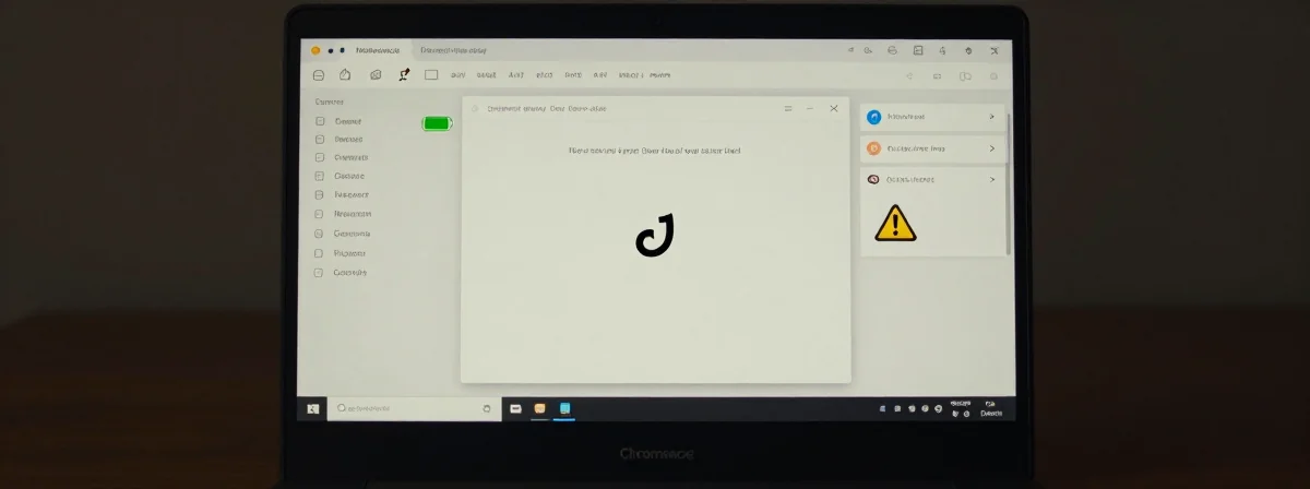
One of the biggest frustrations I encountered was how Google Docs behaves on a Chromebook. By default, the launcher icon opens Docs in a browser tab—not the dedicated app. Why? Because Chromebooks are fundamentally browser-based machines. Google Docs is a web app first, and the “app” is just a shortcut to the web version.
Then there’s the hover-over preview for multiple documents. Instead of showing filenames, you just see the Docs logo repeated. This isn’t a bug—it’s a design choice. Chrome OS assumes you’ll be switching tabs, not hovering over icons. The right-click menu is equally baffling, forcing you to search for documents instead of offering a clear “open dashboard” option.
The irony? Opening multiple Docs tabs manually is actually faster. It’s clunky, but it works.
The Hidden Logic Behind Chromebook’s App Navigation
Here’s something I only figured out after weeks of frustration: Chromebook’s app shelf isn’t meant for deep navigation. It’s a launchpad. If you want to manage your Google Docs, you’re expected to use the web interface or the search bar. The “app” is just a shortcut, not a standalone program.
This goes back to Chromebook’s core philosophy: everything lives in the cloud. Local apps are secondary. When you right-click the Docs icon, the search window that appears isn’t random—it’s pulling from your Google Drive. It’s clunky because it’s trying to bridge the gap between a desktop-like UI and a web-first workflow.
Why Chromebook’s UI Feels Inconsistent (And What You Can Do About It)
The truth is, Chrome OS is a Frankenstein of web and desktop paradigms. Some parts feel like a traditional OS, while others scream “browser extension.” The launcher button, the oversized Control key, the half-baked app shelf—they all reflect this duality.
But here’s the silver lining: you can bend it to your will. Use keyboard shortcuts religiously, remap keys, and embrace the browser-first approach. Chromebooks aren’t meant to replace powerful laptops, but they can work for writers if you understand their limitations.
The Real Problem Isn’t the Chromebook—It’s Your Expectations
After months of wrestling with my Chromebook, I realized the issue wasn’t the device itself. It was me expecting it to behave like a traditional laptop. Back in the 90s, we adapted to new tech because we had to. Today, we expect devices to adapt to us.
The Chromebook’s UI quirks aren’t mistakes—they’re compromises. They reflect a system built for simplicity, speed, and cloud dependency. If you’re writing on one, you’re not fighting the machine; you’re learning to speak its language. And once you do, it might just surprise you.