People keep asking me why some apps have a new keyboard while others don’t. It’s not about preference—it’s about development pipelines and system constraints. Here’s the thing nobody’s talking about: this isn’t just a design change; it’s a fundamental shift in how iOS apps must be built.
Connecting the Dots
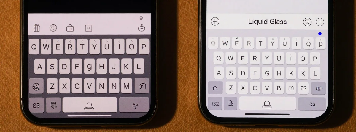
SIDE A: LEGACY UI The legacy keyboard works exactly as expected—no surprises, no gaps. It’s the stable foundation developers know. Apps using this approach maintain their existing UI elements without disruption. For example, Reddit’s solid straight bar sits perfectly flush with the keyboard, creating a seamless experience. The strength here is predictability—developers can focus on core functionality without worrying about UI fragmentation. It’s the safe choice for apps with complex layouts or tight deadlines.
SIDE B: LIQUID GLASS The Liquid Glass keyboard introduces rounded outlines and transparency effects that match iOS 26’s design language. When implemented correctly, it creates visual harmony with the system’s new aesthetics. Apollo (before its removal) demonstrated this well, with the curved keyboard integrating naturally into its interface. The advantage is a modern, cohesive look that aligns with Apple’s vision. However, this requires significant UI adjustments—any app with custom elements above the keyboard must account for the new rounded shape to avoid awkward gaps or misalignments.
THE REAL DIFFERENCE Here’s what most people miss: the keyboard change is just the visible tip of a massive development iceberg. Adopting Liquid Glass means every native UI component transforms automatically when built with SDK 26. This forces developers to either rebuild their entire UI to match—or painstakingly override each component to preserve their original design. As one developer noted, implementing Swift concurrency changes alone took four months behind the scenes. The keyboard is technically the easiest part—it’s the collateral damage to other UI elements that creates the real bottleneck.
THE VERDICT If you’re maintaining a complex app with custom UI elements, stick with legacy until you can dedicate resources to a full UI refresh. If you’re building a new app or can afford a complete redesign, Liquid Glass offers a more modern foundation. From experience, the deadline pressure is real—any app updated after mid-April must use the new keyboard. But don’t rush it: I’ve seen apps that adopted early ended up with mismatched UIs that confused users more than the old keyboard ever did.
Unanswered Questions
The gap between what users see and what developers face is widening. While most people won’t notice the keyboard difference, the work behind it could make or break an app’s stability. Before you demand “just update the keyboard,” consider that this isn’t a simple toggle—it’s a system-level change that requires architectural decisions. The real test won’t be whether apps adopt the new keyboard, but how well they handle the invisible work that comes with it.