People keep asking me why the iPhone camera feels so clunky these days. Why do simple tasks like turning the flash on or toggling Live Photos require hunting through menus? I’ve been using these devices since the first iPhone, and the shift from direct controls to gesture-based options isn’t just a design choice—it’s a fundamental change in how we interact with our cameras.
Here’s the thing nobody’s talking about: what Apple calls “intuitive” is actually making basic functions harder to access when you need them most.
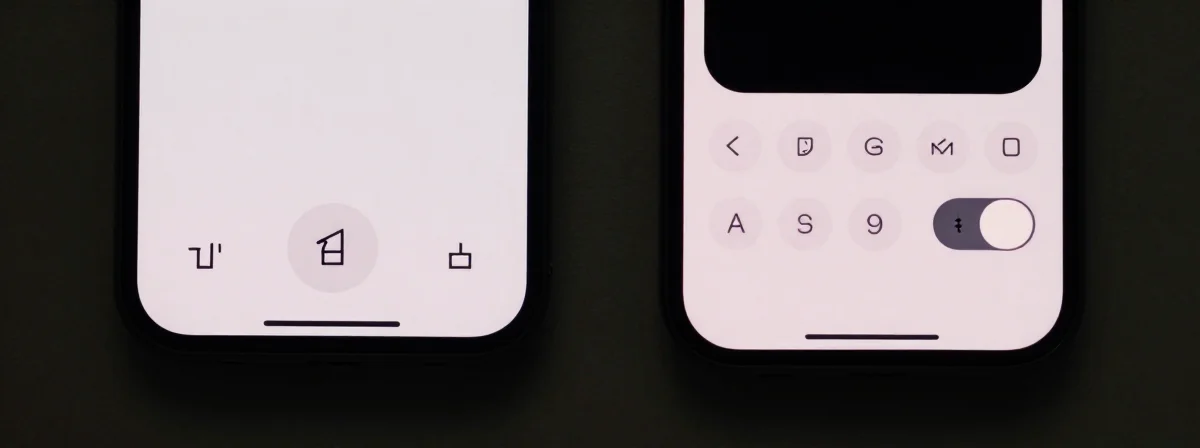
Connect the Dots
SIDE A The old-school approach—direct toggles—was simple and reliable. Tap the flash icon once, and it turned on. Tap Live Photo once, and it activated. There was no ambiguity. This system worked perfectly for quick captures, especially in low-light situations where you don’t have time to fumble with menus. It was designed for immediacy, and that’s what photography often demands—split-second decisions without hesitation. For anyone who regularly shoots in challenging conditions, this direct method was a lifesaver.
SIDE B The new gesture-based system hides options behind tap-and-hold interactions. To turn the flash on, you have to hold the icon; to access advanced settings, you swipe or tap tiny icons. Apple argues this creates a cleaner interface, but it comes at the cost of speed. The six-dot menu for video settings, for instance, requires precise tapping on a small target—44x44 pixels, as noted in the discussion—just to cycle through options that should be accessible with a single tap. This approach favors discoverability over efficiency, which is great for exploration but terrible when you’re trying to capture a fleeting moment.
THE REAL DIFFERENCE Here’s what most people miss: the shift isn’t about better design; it’s about Apple pushing users toward cloud services and more complex workflows. By hiding basic toggles, they encourage us to use settings menus more often, where they can subtly nudge us toward features like iCloud Photo Library or ProRAW. The Live Photo toggle, for example, was moved to a settings menu not because it wasn’t useful, but because keeping it active by default would consume more local storage—a clear incentive to rely on cloud solutions. After years of using both systems, I’ve seen how these small changes add up to a bigger strategy: making the device feel less like a tool and more like a gateway to Apple’s ecosystem.
THE VERDICT From experience, if you’re a photographer who needs speed and reliability—whether you’re documenting events, shooting in dim conditions, or just snapping quick family photos—stick with the direct controls or find workarounds like the Settings toggle for Live Photos. If you’re someone who enjoys exploring camera features and doesn’t mind the extra steps, the gesture system might not bother you as much. But make no mistake: if you’re doing professional or time-sensitive work, the old method’s the clear winner. If you’re doing casual shooting and don’t mind hunting for options, the new system might feel fresh at first.
The Truth Is Out There
The camera should be the most accessible tool on your phone. When basic functions require hidden gestures or multiple taps, it’s not innovation—it’s obfuscation. Don’t let the sleek interface fool you; the best design is the one that gets out of your way. If you find yourself missing the old controls, hunt down those settings toggles—your future self will thank you for saving precious seconds when it matters most.